
Tuesday, 8 May 2012
Flat Plan
Wednesday, 25 April 2012
Evaluation - Q7. Looking back at your preliminary task, what do you feel you have learnt in the progression from it to the full product?

When I first started using Microsoft Publisher
for my preliminary task, I found it difficult to get the hang of making a
magazine. I did not know exactly how magazines were constructed or formed in
order to attract a certain demographic. I also found it hard to focus on the mode of address because my target audience was very broad. This is why I believe that my
preliminary task was not done to my best capability. It was unorganised, the copy did not line up
and the images were placed all over the place. The typography also did not
represent my demographic which were students, parents and teachers. It was too
funky and not as serious as a school magazine should look like. The pictures on
the contents page also did not to any of the stories. This shows that I was
unfamiliar to how magazines link everything and have the same theme throughout
the magazine.
In magazines, there is usually a three colour
theme throughout the whole magazine. Even if there isn’t a three colour theme,
there is always some sort of theme colour throughout the magazine. This helps
the reader to define between the different sections in the magazine. For my
preliminary task, the colour theme changed from the front page of being black,
baby blue and yellow to being on the contents page of dark blue, black and
white. This made my school magazine look unprofessional and rather odd.
After researching about the structure and form of
magazines, making my final music magazine proved to be a lot more time
consuming however easier because I knew how to construct it so it looks more
professional. For the front page and contents page, I found it a lot easier to
form them to attract a certain demographic of young teenage girls. However, for
the double page spread it was more difficult because we did not make one for
the preliminary task so I had to find out and research the forms and
conventions of a double page spread.
 I found out how the front page, contents page and
double page spread were constructed by finding two different magazines which
were aimed at different demographics and analysing them. This helped me to see
how magazines who are aimed at a similar demographic to me construct and form
their magazines in order to attract their target audience. It provided me with
the information I needed to in order to make my magazine look professional. It
built up my skills in using Microsoft Publisher, using all aspects of the
programme to make my magazine look as proficient as possible.
I found out how the front page, contents page and
double page spread were constructed by finding two different magazines which
were aimed at different demographics and analysing them. This helped me to see
how magazines who are aimed at a similar demographic to me construct and form
their magazines in order to attract their target audience. It provided me with
the information I needed to in order to make my magazine look professional. It
built up my skills in using Microsoft Publisher, using all aspects of the
programme to make my magazine look as proficient as possible.
While making the preliminary task, the pictures I
used which I took were not photo-shopped using Photoshop or Photo Sherif.
However when doing my music magazine, both or one of these programmes had to be
used. I decided to use Photo Sherif because I found it easier. From using this
programme, I have learnt and gained a lot of new skills such as cropping the
background, whitening and getting rid of spot blemishes. It look me a while to
get used to using it because it was my first time using such a programme to
manipulate photos to make them look better than life (hyper-reality). I did not
airbrush my images or use cropping to make the models body look slimmer because
from the research I carried out, it showed that it made the models look unreal
and it gave the wrong image to young girls. The young girls look up to the
people featured in magazines as inspiration, so if I did crop their body or
airbrush them, it would make the young girls see something that isn’t real as
being perfect.
Along with the technological skills, I have also
gained insight into theories that magazines use such as The Male Gaze and Uses
and Gratification theory. I learnt that magazines purposely use the pictures
where the models pose fits the male gaze. They use this to attract their
audience which sells their magazines. All magazines do this because as the
theory suggests, we look at everything from a males perspective (the camera
lens is seen in a male’s perspective). Magazines also use the Uses and
Gratification theory in order to help the readers relate to the magazine and
articles. This is so the reader can escape from everyday reality problems. This
is why magazines mainly use interviews in their double page spreads. Interviews
tend to draw the reader in because it makes the reader feel as if they are
asking the questions and they are getting the answers straight away, so it is
as if they are interviewing the person themselves.
Overall, I have learnt and developed many
technological skills in order to make the final product from the preliminary
task. Researching about magazines has helped me make my final product look more
professional and formal. My preliminary task was not done to my best ability
because I did not have the knowledge that I had about magazines when I made my
final product. This is why my music magazine is better than my preliminary task
of a school magazine.
Tuesday, 24 April 2012
Evalutation - Q6. What have you learnt about technologies from the process of constructing this product?
   |
I used Microsoft Publisher in order to contruct my magazine. This was a good programme to use in order to line up all of the copy and the page numbers as it had lines which went on the side of the page numbers which would let you know when the lining is right. There is also a wide variation of colours which can be used in the magazine which also helped as I wanted to go for a watered down colour. However, using Miscrosoft Publisher I came across some problems. For example, I couldn't get the exact same colour for the background on each page because Publisher would not save the colour that I had on the front page. Also, when writing the copy (article) on the double page spread, I realised that the text didn't fit around the quote well. There were a lot of spaces which made the magazine look unprofesssional.The text didn’t wrap around the quotes automatically so therefore I had to increase the gaps between some of the words to make the text wrap properly. Most magazines and newspapers do this so they do not have huge haps which would make magazines and newspapers look more qualified.


 For the pictures, I used picture sherif. This helped me with the layout and editing of the photos. I used photo sherif in order to brighten the picture by using 'warmer', whiten the eyes and crop the photo. This is the first time I ever used photo sherif so it was a new experience which meant I learnt how to use a lot of the tools in order to edit my pictures. It was very easy to undo an edit if you did it wrong, which I did many times. This is how I made the pictures look professional and hyper-realistic without airbrushing them.
From using these technologies, it has shown me that the magazine creator has all the power to represent their magazine in any way they want. However, using desktop publishing in order to make my magazine fit or challenge the code and conventions was hard becuase this is not a professional standard software used by major magazines. Using sherif and photoshop has helped me in the learning process of contructing the mode of address.

Evaluation - Q5. How did you attract/address your audience?
My front page will be the main incentive to attract my audience. The masthead is funky and girlie which fits in with the main image as they are seen to be girlie and cute. The main image identifies with my target audience as they are both young girls who are in their mid-teens. They are also seen as not the typical teens as one of the girls have an eyebrow piercing. This means that this magazine can also relate to the ‘unusual’, not typical young teens which means my magazine relates to almost every young teenage girl out there wanting to buy my music magazine.

On the front page, I have included free giveaways and competitions. I used the competition of winning 2 tickets to see Justin Bieber and a free giveaway of a make-up set picked by Katy Perry. This is a way of attracting my target audience in order for them to purchase my magazine. I chose Justin Bieber and Katy Perry because they are very popular music artists at the moment and my audience like to listen to both of their songs. The promotion suggests that they can win the tickets. This will help my target audience engage with my magazine and use synergy. Due to the advancement in technology, the internet is more accessible to young children now compared to 30 years ago. As shown by figures by the ONS 77% of households have internet access. Also, I have found that 45% of internet users used a mobile phone to connect to the internet, and as more young people are getting mobile phones (smart phones) then the number of young children using the internet will be increasing.


Creating a user account on twitter and creating a fan page for my magazine will help my audience engage with the magazine using different social media platforms. I will also create an actual website where all stories and things on the printed magazine will be on the website. This helps in attracting my audience as most young teenage girls own a laptop and would rather use the internet than go out and buy a magazine.

The Uses and Gratifications theory explain why we use the media. I have used this to attract my audience because we use the media in order to entertain ourselves and provide ourselves information. I have used this in my magazine in order for my demographic to feel entertained by the stories covered in the magazine, which also allows them to be provided with information about their aspirations. The magazine gives an escape from everyday life, and instead helps to be indulged by the stories and pictures on the magazine. As the article is an interview, it helps the audience get lost in the copy as it makes them feel as if they are asking the questions.
Personal identity is also another aspect of the Uses and Gratifications theory where the audience find reinforcement for personal values and finding models of behaviour. The people that I have used in my magazine are models for young teenagers. Integration and social interaction is used in my magazine to attract the audience as it is enabling the readers of my magazine to connect with society through reading the magazine.
Personal identity is also another aspect of the Uses and Gratifications theory where the audience find reinforcement for personal values and finding models of behaviour. The people that I have used in my magazine are models for young teenagers. Integration and social interaction is used in my magazine to attract the audience as it is enabling the readers of my magazine to connect with society through reading the magazine.
Evaluation - Q4. Who would be the audience for your media product?
I decided that I would aim my magazine at young teenage girls aged between roughly 11 and 14. My demographic are still seen as children, past the age of around 14 their taste and interests change and become more mature.
I chose my demographic by creating a questionnaire on QuestionPro (http://www.slideshare.net/Shivie18/questionnaire-results-12572904) and uploading it to Facebook and twitter. I also presented my media results (http://youtu.be/zwIjvGnaBgU). This showed the demographic that I will be aiming my magazine at. By using QuestionPro, it made it easier to pick out my demographic which I presented using graphs on Microsoft PowerPoint. From the questionnaire I found out how often my demographic buy magazines, their favourite music artists, who they aspire to etc. The results helped my construct and form my magazine in order to fit my target audience. From my questionnaire I found that most of my demographic listen to pop music, as supposed to heavy metal. I also found out that most of the music artists answered when asked ‘Who is your favourite artist?’ was pop music singers. This links back to when I found that most of my target audience listen to pop music such as Justin Bieber, One Direction and JLS. This therefore helped with who I was aiming my music magazine at, young teenage girls who listen to pop music. Also, as most of the artists chosen were male, it suggests that all young teenage girls think about are boys, showing that I will have to attract my audience by using pictures/stories about some boys in my magazine, however my magazine would not be covered by boys because it is not the best way to represent young girls and so therefore I would have free giveaways so there are other incentives to buy the magazine.


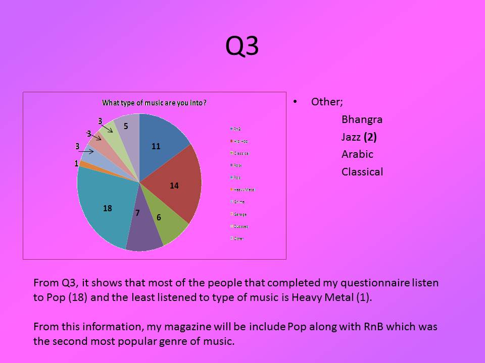


The results also gave me an insight into how often people buy magazines. Most of them said never, however a lot said once a month. This helped me decide that I will release my a magazine issue once a month but I will also get my magazine on the internet in order to keep up with the latest trends as more and more people go on the internet to look at the news or magazines. Most of the people who took my questionnaire wanted to be a tiger. This shows that they want to be seen as powerful and independent people. The results also helped me pick out a price range for the magazine. I will price my magazine at £2.00 because my demographic will not have jobs and their parents might also buy the magazine for them. So putting the price low will give them an incentive to buy the magazine because it will be cheaper than other girlie music magazines.
When asked who they aspire to be, most of them put successful people who have a lot of money. However, some said ‘no-one’, this shows that young teenagers would like to be themselves and wouldn’t want to change to be anyone else. This is showing that the media is encouraging the younger generation to become independent. However, young people still follow the celebrity culture by reading stories about them and wanting to have some of their success. From this answer, it helped me decide to put famous aspiring people on my magazine that the younger generation will be able to relate to. I then finally found out what they aspire to be when they are older. This linked in with Maslow’s Hierarchy of Needs as they would like to be near the top at the ‘Esteem’ or ‘Self-actualization’ stage.
I then created an audience profile which contains everything that my demographic like and enjoy. It is the results of my questionnaire put into picture forms in order to make it look better so it is more visual what my demographic like.
The artists that I added to my magazine excluding the main image included music artists such as Justin Bieber, Victoria Justice, Cheryl Cole, The Wanted and Demo etc. The reason why I included these specific artists in my magazine is due to their publicity and screaming fans. Demo is a recently discovered artist who writes his own songs, like Justin Bieber. However, the difference is the genre of music, Demo is rap and Justin Bieber is more pop. They are both artists which young teenagers can inspire too as they were both studying when they got their big break and are still studying. I chose Cheryl Cole because of the amount of bad publicity she has had and with the recent events happening with her husband cheating on her, no matter how bad it was, she managed to get right back up. This is a good role model to young teenage girls as it shows that they can be strong and confident women too.
Along with the qualitative data from the questionnaire, I also gathered quantitative data. This is from the small focus group to which I handed the templates of my magazine too. I asked them about the construction and the form of my magazine, which one they preferred and why. This helped me in the construction, colour scheme and form of my final music magazine product. They liked the construction with the colour scheme of watered down colours pink and purple. The contents page and double page spread however looked emptier so they suggested adding more images. I took all their advice and criticisms on board when creating the end product of my magazine.
I also researched other music magazines aimed at a similar or the same demographic as me. This was to see their construction and colour theme. It would help me in order to make my magazine stand out more to attract my demographic as music magazines aimed at the same demographic as mine are seen as competition.
Evaluation - Q3. What kind of media institutions might distribute your media product and why?
There are many ways in which I could publish my magazine. There are major publishing houses such as EMAP and IPC, independent publishing houses and self-publishing houses such as Fanzine and Sniffin’ Glue.
 Major publishing houses specialise in magazines which are aimed at mainstream audiences and have departments which are dedicated to specific areas in each magazine meaning they have more resources and money. This shows that major publishing houses are very powerful in the magazine industry. EMAP have three separate operating companies, focussed on customer needs in separate market areas; Events and festivals, Information services and Publishing. They own many magazines such as Screen International, Broadcast, Retail week etc. however they have owned other magazines in the past such as Smash Hits and Nintendo Office Magazine. EMAP have previously owned a magazine which is to a similar demographic to me by owning Smash Hits, it shows that they will have the resources and experience in order to make my music magazine big in the young teenage demographic music magazine industry.
IPC focuses on three core audiences: men, mass market women and upmarket women. IPC publish very few music magazines and mainly publish life style magazines such as Look and Now. The main music magazine they publish is NME which is a very successful music magazine which is mainly aimed at men. They also have an IPC digital sales department. It reaches over 20 million unique users every month, across more than 30 sites such as www.nme.com and www.marieclare.co.uk. It helps the magazine producer to target their customers through a specific brand, defined audience group or relevant editorial context. This helps reach many of their target audiences as men, mass market women and upmarket women use the internet a lot more knower days than before. NME has built on its heritage and credibility to become a truly unique multi-platform media proposition. Across the magazine, www.nme.com, NMETV, NME Radio and the brand's live events and awards, NME reaches over one million music fans every week. Uncut is the most authoritative music and movie magazine. Every month, it celebrates all that is great in rock and film, both new and old, cult and classic. Using a major publishing house such as EMAP and IPC carries a risk as there is no guarantee it will be successful as they are not as passionate about the magazine as independent publishing houses are.
 Another way to publish my magazine is through independent publishing houses. They generally focus on the high end magazines for a niche market. Normally if independent publishing houses magazine become successful and very popular, major publishing houses would buy it. One example of a independent publishing house is ‘Church of London’ which publish two magazines, Huck and Little White Lies, which embody their passion for creating something of their own, and in doing so connecting with other like-minded individuals. My music magazine is not for a niche market and so using an independent publishing house would not be the best way to reach my mainstream demographic.
  Finally, the last option of publishing my magazine is by using self-publishing houses which are online publishing, e-zine. Two main magazines use this Sniffin’ Glue and Fanzine. Sniffin' Glue is the name of a monthly punk zine started by Mark Perry in July 1976 and released for about a year. The name is derived from a Ramones song "Now I Wanna Sniff Some Glue. Others that wrote for the magazine that later became well known journalists include Danny Baker. Although initial issues only sold 50 copies, circulation soon increased to 15,000. The innovative appeal of Sniffin' Glue was its immediacy. FANZINE is an online general culture magazine that was launched in August 2005 at the CMYK Independent Magazine Festival in Barcelona, Spain. Blogs are the cheapest, fastest and easiest way that gets your music writing out there – but that hasn't stopped a new generation of writers picking up the stapler and putting out a fanzine. Using a self-publishing house would get to my demographic of young teenage girls as more and more computers are being brought and so therefore more and more of my demographic will be using the internet. It will also help the environment as fewer trees would need to be cut down to make this magazine. However, publishing my music magazine online would mean that I would have to change the form of my magazine which would be very time consuming and may not be worth it if my magazine doesn’t hit/meet the target audience. Also printing a magazine would make the magazine look better as it would be more impressive and look more formal.
Taking everything into account I have decided to distribute my magazine using major publishing houses as I feel that my demographic is big enough for a major publishing house to be able to cater for. I think EMAP would be the best option for my magazine because even though IPC sell one of the biggest music magazines, EMAP have the experience in selling young teenage music magazine and with their knowledge and skills; they will know exactly what my demographic like and need. I will have to use synergy in order to appeal more to my demographic as the sales of magazines have been falling year on year becuase people can now get all their information on the internet. This means that I will use EMAP's knowledge in order to promote my magazine online and get the audience to interact with it. With any of the publishing houses due to audience fragmintation, I will be using synergy in my magazine by interpreting websites and advertising my product on other social media platforms (e.g. Facebook, Twitter).
Evaluation - Q2. How does your media product represent particular social groups?
 I had to keep in mind who I was trying to represent when making the magazine and the way I construct my mode of address. As my demographic are young teenage girls, they perceive friendship to be the most important thing in their lives. They value their friendship with others a lot, which is why I have used two artists on the front of my magazine. They are best friends which will appeal to my demographic. The main images in my magazine are of the two best friends. On the double page spread there is a full length picture which shows their whole outfit. Both of the girls are wearing the same shoes and the same colour top (blue). I did this purposely because the social group I am aiming for, if they have a best friend, they would normally dress similar in order to make them look like one. Also, the pose of each picture is in line with the male gaze and the stereotypical image of young teenage girls. This is because the poses are very childish and seen all the time on social networking sights when young teenage girls take pictures of themselves. This also links with Maslow’s Hierarchy of Needs as friendship is seen as ‘love/belonging’ however because the girls in my magazine have a sense of achievement and confidence as they ‘hit number 1 in the UK charts!’ (Contents page) which puts them in ‘esteem’, it shows that they are identifying with my target audience as my demographic will be able to relate with the artists as young teenage girls have friendships and confidence.
My images are not airbrushed and the girls are not wearing anything fake (e.g. fake nails, hair extensions). This is so I don’t represent my demographic in a hyper-reality view. Hyper-reality is used in semiotics to describe a hypothetical inability of consciousness to distinguish reality from a situation of reality. Airbrushing would have shown the girls in the main image in a non-realistic way and therefore make the images and magazine not relatable to young teenage girls. As shown by the Britney Spears image, where it adopts the hyper real theory of airbrushing and making the model look better than reality. From data that I have collected from the ONS website. I have found that in a survey of girls aged 9-10, 40% have tried to lose weight. I have also foung that 10 year old girls and boys are dissatisfied with their own body after watching music videos. This shows the impact of airbrushing and hyper reality on young girls and boys. Another report on young teenage girls in America found that 53% of American girls aged 13 were 'unhappy with their bodies'. This grew to 78% by the time the girls reached 17. This could be interpreted as a result and effect of the use of hyper reality in the media industry.
The typography I have used is mainly in lower case and seen as fun and cute. This is to help the typography and magazine relate to my target audience as it is a representation of femininity. Everything on the front page, contents page and double page spread has been placed there for a reason which is mainly to identify and attract my target audience. This is mise-en-scene.
Uses and Gratifications theory assumes that members of the audience are not passive but take an active role in interpreting and integration media into their own lives. It suggests that people use the media to fulfil specific gratifications. There are 4 categories for the different uses of media (diversion, personal relationships, personal identification and surveillance). I have used this in my magazine as my magazine has used personal relationships in order to represent my target audience. The personal relationships used in my magazine were the girls used in my magazine (best friends) and some of the stories on the contents page (Justin Bieber, dedicated new album to his new love and Demi Lovato, reveals secrets about her love life and ex boyfriends). Also surveillance has been used as the demographic will be ‘following’ the artists in the magazine by reading the articles and looking at the latest pictures of them.
Sunday, 22 April 2012
Evaluation - Q1. In what way does your media product use, develop or challenge forms and conventions of real media products?
 My music magazine follows many of the forms and conventions
of a mainstream magazine. On the front page of my magazine, the masthead is
placed behind the main image. This is to show that the story of the people in
the main image is more important than the name of the magazine, showing that
the magazine is well known in order for the masthead to be hidden. Also, the banners
at the top and bottom of the page containing promotions and other artists are
following the convention. The promotions are usually free giveaways to see a
famous music artist in concert or a general giveaway of something the target audience
like. I have developed this convention by promoting Justin Bieber tickets. I
chose Justin Bieber because my target audience are young teenage girls, and
young teenage girls like Justin Bieber. When the consumers apply for the
tickets to be won, they can either go to the magazine’s website or post a
letter to the magazine warehouse. This is to promote my magazine by using
synegy in order to keep up with the latest trends as more and more people are
going on the internet and looking at stories from their favourite magazines
instead of buying them. The ‘other artists’ banner has music artists that my
demographic enjoy which will attract their attention. A barcode is also a
convention of mainstream magazines. I have placed mine on the top right of the
front page. The main image convention is for it to take up almost the whole
space on the page. My main image does this as the picture has been enlarged in
order to show that these girls are the main story. Having incentives to attract
your target audience is also used in many magazines. I have given another
incentive for young teenage girls to buy my magazine because of they do they
can win the newest make up kit picked by Katy Perry. As Katy Perry is a huge
star, this will surely attract my target audience. The typography I have used
is developing the convention and forms on magazines aimed at young teenage
girls as it is soft and girlie. I used ‘comic sans’ as it is a soft typography.
This helped with my mode of address as it helped communicate with my
demographic. The background of my magazine on all of the pages consists of hearts and stars. These are the signs and symbols that I used to attract my audience. The semiotics of hearts convey a sense of friendship which links to the main image. The stars illistrate the star life of the people featured in this magazine, showing that they have the life and so can the reader if they purchase it. This shows that my demographic are sold on the dream of the 'high life' of stardom.
My music magazine follows many of the forms and conventions
of a mainstream magazine. On the front page of my magazine, the masthead is
placed behind the main image. This is to show that the story of the people in
the main image is more important than the name of the magazine, showing that
the magazine is well known in order for the masthead to be hidden. Also, the banners
at the top and bottom of the page containing promotions and other artists are
following the convention. The promotions are usually free giveaways to see a
famous music artist in concert or a general giveaway of something the target audience
like. I have developed this convention by promoting Justin Bieber tickets. I
chose Justin Bieber because my target audience are young teenage girls, and
young teenage girls like Justin Bieber. When the consumers apply for the
tickets to be won, they can either go to the magazine’s website or post a
letter to the magazine warehouse. This is to promote my magazine by using
synegy in order to keep up with the latest trends as more and more people are
going on the internet and looking at stories from their favourite magazines
instead of buying them. The ‘other artists’ banner has music artists that my
demographic enjoy which will attract their attention. A barcode is also a
convention of mainstream magazines. I have placed mine on the top right of the
front page. The main image convention is for it to take up almost the whole
space on the page. My main image does this as the picture has been enlarged in
order to show that these girls are the main story. Having incentives to attract
your target audience is also used in many magazines. I have given another
incentive for young teenage girls to buy my magazine because of they do they
can win the newest make up kit picked by Katy Perry. As Katy Perry is a huge
star, this will surely attract my target audience. The typography I have used
is developing the convention and forms on magazines aimed at young teenage
girls as it is soft and girlie. I used ‘comic sans’ as it is a soft typography.
This helped with my mode of address as it helped communicate with my
demographic. The background of my magazine on all of the pages consists of hearts and stars. These are the signs and symbols that I used to attract my audience. The semiotics of hearts convey a sense of friendship which links to the main image. The stars illistrate the star life of the people featured in this magazine, showing that they have the life and so can the reader if they purchase it. This shows that my demographic are sold on the dream of the 'high life' of stardom.
However, I have challenged some of the forms and conventions
of magazines. Many magazines use unrealistic models in order for their
magazines to appeal to a wider audience. I have challenged this convention by
using ‘real’ girls in my magazine. My images have however been photo shopped
and are also posed in line with the male gaze. This is a convention used in
every magazine. It is to appeal to all audiences as it is seen as ‘The Male
Gaze’. It is a feminist theory when the audience is put into the perspective of
a heterosexual man. The photos that I have used and the whitening with the eyes
are all in line with the male gaze. Airbrushing is also in line with the male
gaze and is a convention for many magazines, however I challenged this
convention and I did not airbrush any of the pictures I have used in my
magazine. Even though the pictures are in line with the male gaze, by not
airbrushing them it is a selling point to show how women really look like. This
is to make the representation of women/girls more realistic. This would appeal
to parents who would buy this magazine for their children.
Young girls are more attracted to females who are in line
with the male gaze. It was shown by a research conducted by my media class to 10
girls who are in year 7 (which are around the age for my target audience). We
showed them 6 pictures of different models, some were posed and some weren’t. The
year 12’s first put them in order from ‘prettiest’ to the least pretty. Then we
gave them to the year 7’s to put in order to see whether it matched the year 12’s.
We found that the findings were very similar. When asked why they said one of
the girls was the prettiest, they said because she looked ‘girlie’ and ‘cute’.
Plus, when asked why they chose the most unattractive picture, they said she
looked ‘ill’ and because ‘she didn’t have any make-up on’. Posing in line with
the male gaze is usually a woman looking vulnerable and childish, with a lot of
skin showing. Also, normally the pose would not be done by a man as shown by these
pictures. If you saw two men doing the same pose at the women, it would not fit
in with the male gaze. This theory is suggesting that the camera is a male, as
we are looking at the picture from a male perspective.


 For my contents page, I have followed many conventions like
page numbers and having different sections for different parts of the magazine
along with the page number of the article next to them. There is also a main
image which links to the same main image and main story on the front page and I
have also used the same typography. This is in order to follow the theme and
convention of the magazine.
For my contents page, I have followed many conventions like
page numbers and having different sections for different parts of the magazine
along with the page number of the article next to them. There is also a main
image which links to the same main image and main story on the front page and I
have also used the same typography. This is in order to follow the theme and
convention of the magazine.
 The double page spread has broken many conventions such as
having two main images instead of one and not having a little black box at the
end of the copy to show the reader that it is the end of the article. I have
followed and developed the convention of having at least one quote in the copy.
This is to show the reader glimpses of what the copy has in store for them. To
help the reader navigate their way through the double page spread, one of the
pictures has slightly gone over the second page. This is to show that both
pages are linked. With the larger image, I decided to keep the bar that they
are sitting on because it looks as if they are in a playground which will appeal
to my demographic. I have also followed the convention of putting an anchor on
the bottom left hand side of the left page. An anchor is used generally to subconsciously
tell the reader how they should feel about the picture/article. The double page
spread copy is about the girl’s inspirations and dreams and how they made it
come true. This is using ‘Maslow’s Hierarchy of Needs’ theory. I am selling the
demographic their dreams and aspirations. My magazine is in the ‘esteem’ stage
as it is selling self-esteem, confidence, respect for other and respect by
others to young teenage girls. My magazine gives a sense of dreams and aspirations. The people who buy my magazine will be sold on the 'dream' that I am selling them of young girls who had a talent, pursued it and made it big in the music industry.
The double page spread has broken many conventions such as
having two main images instead of one and not having a little black box at the
end of the copy to show the reader that it is the end of the article. I have
followed and developed the convention of having at least one quote in the copy.
This is to show the reader glimpses of what the copy has in store for them. To
help the reader navigate their way through the double page spread, one of the
pictures has slightly gone over the second page. This is to show that both
pages are linked. With the larger image, I decided to keep the bar that they
are sitting on because it looks as if they are in a playground which will appeal
to my demographic. I have also followed the convention of putting an anchor on
the bottom left hand side of the left page. An anchor is used generally to subconsciously
tell the reader how they should feel about the picture/article. The double page
spread copy is about the girl’s inspirations and dreams and how they made it
come true. This is using ‘Maslow’s Hierarchy of Needs’ theory. I am selling the
demographic their dreams and aspirations. My magazine is in the ‘esteem’ stage
as it is selling self-esteem, confidence, respect for other and respect by
others to young teenage girls. My magazine gives a sense of dreams and aspirations. The people who buy my magazine will be sold on the 'dream' that I am selling them of young girls who had a talent, pursued it and made it big in the music industry. Analysing double page spreads of music magazines

Magazine double spread pages convention is to have a three
colour theme as part of their branded identity. The NME magazine normal three colour scheme is red,
black and white, however for the ‘Radar’ page they have gone against their main
scheme and used blue, black and white
which is in line with the three colour theme convention. NME changed the red to
blue to make this story look new and exciting. This also links with title
‘Radar’ which has connotations of something new and exciting showing that the
artists on this page are on the radar (new). However, the Top of the Pops
magazine is breaking the three colour scheme convention by having six (blue,
pink, yellow, orange, white and black) different colours. As this magazine is
aimed at a young teenage demographic, using more than three colours captures
the demographics attention as it shows that this magazine is young and fun.
The convention is for one of the double spread pages to have
a main image; both magazines fill up one of the pages with a main image. This
is following the convention of a magazine, however NME is more in line with
this convention as the main image is usually on the left page.
The two pages are linked which helps the reader navigate
their way through the double spread visually. Both magazines integrate the
pages by making the title overlap both pages. This is to create a narrative
flow between both pages. The Top of the Pops magazine also has images of
unknown artists down the bottom of the page which overlaps both pages,
indicating that there is more to know about ‘Camp Rock’ and that both pages are
relating to the same story. It also shows to the reader where the story begins
and ends.
The typography used in the titles is useful. Top of the Pops
font is not formal and quite simple. This is relatable to their demographic of
young teenage girls as the font is quirky and eye catching. Compared to the NME
magazine, the typography for the copy is very similar, however for the title is
bolder because it is in capitals and is in jet black. This draws in the
demographic of people who enjoy Indie music.

Under the title, the convention is to have a subheading. The
subheading is meant to give more information about the copy below it. They are
usually tailored for their demographic and made to look ‘smart’ so only the
demographic who know the artists understand the subheading. The NME subheading
is an innuendo which is used to make the people who understand it feel
smarter/better than everyone else.
Within the copy, the convention is to have at least one
quote from the copy in bold, bigger than the rest and somewhere in the middle
of the copy. The quote also acts like an anchor. This is eye catching and grabs
the reader’s attention to the copy. The quote normally shows the key
information said by the artist in the copy. Both these magazines follow this
convention. However, Top of the Pops does not follow convention of the first
letter being bigger than the rest. The convention of the first letter being the
biggest is to show the reader where the article starts.
The convention to show that it is the end of the copy is a
little black box at the end of the article. Both articles go against this
convention as the NME magazine uses a red box including the NME website which
is using synergy as it is promoting their website. The box is red to relate this
article back to the front cover as the three colour scheme is red, black and
white. The Top of the Pops magazine goes against the convention and does not
have anything to show that it is the end of the copy. The copy in a pop magazine is mainly an
interview or short story. The Top of the Pops magazine is in line with the
convention as the copy is a short interview with The Jonas Brothers.
The box on the side of the NME magazine does not have
anything to do with ‘The Teenagers’ as shown by the black background, however
it is still liked to the same page and subject of being on the ‘Radar’ as the
blue is overlapping both the main story and the little stories on the side
about upcoming new artists.
There is an information box which is used in many magazines
which gives facts and additional information about the artists. NME have made
the information box look like a note pad, this is to relate to their
demographic as most of the people who read NME are older teenagers who own
notepads showing that they are the first people to know about this new band.
An anchor is used on every image in most mainstream
magazines like the NME. An anchor is used to steer you and tell you how you
should feel about this image. The Top of the Pops magazine is going against the
convention of having an anchor as it does not have one on any of the pictures.
NME has gone against the mainstream of the magazine by
putting an ‘NME loves’ stamp. This has connotations of the band being new and
unfinished, almost s if the band is not sophisticated yet. This however would
be a convention of a pop magazine as the artists they feature are not well
known and are usually aimed at the younger demographic.
Analysing contents pages of music magazines

The main convention of a contents page is the 3 colour
scheme. The 3 colour scheme identity of the magazine which is featured on the
front page should be the same on the contents page as it reinforces the
magazines identity. This is what the NME magazine has done; they have kept the
NME brand colour of red, white and black. However, Mizz magazine has gone
against the convention and have added more colours to the subheadings of the
contents page. Mizz magazine have used different colours for the subheadings so
it is easier for the reader to navigate their way through the magazine and to
keep an eye out for each section they are looking for. They have done this because their magazine is aimed at a younger demographic which has made the magazine look more feminine, childish. Mizz magazine is coded for a different target audience.
The contents page tends to be organised and ordered into
sections which helps the reader find the way through the contents page. Both
magazines do this as the NME has 3 sections; band index, cover story and the
subheadings and feature stories. Another way the NME helps the reader steer
their way through the contents page is by having ‘NME’ and ‘band index’ in red
and ‘This Week’ and the rest of the page in black. ‘Mizz magazine also has 3
sections; welcome (which includes pictures of feature stories), contents (which
included subheadings and other feature stories) and mizz. These subheadings
help the reader through the magazine and find the part they are looking for.
The contents page name is usually named ‘Contents’. The
convention is to place the title on the top right hand corner of the page. NME magazine
follows the convention of putting the title on the top right hand corner of the
page, however the NME is breaking the convention because instead of calling the
contents page ‘Contents’ they called it ‘NME This Week’. Mizz magazine is not
following the convention also as they called the contents page ‘Welcome!’, and
place the title on the top left hand corner.
Usually recently an editors letter has become more common in
magazines, however both the NME and Mizz do not yet have an editors addition. However, Mizz have incorperated their editors addition into their contents page.

At the bottom right corner of the NME contents page, there
is a small caption showing the reader where to find the ‘gig guide’. It is in
red so it stands out from the black and links in with the ‘band index’ section.
Another convention of a contents page is to have a little
copy of what the cover story is about. In the NME they follow this and also a
quote from the main feature story is also a convention; ‘...Oasis kicked off their
world tour’. Mizz magazine contains a little bit of a story, however does not
have a quote and so it is therefore breaking the convention. Although both magazines follow the same form and convention, they are both aimed at different audiences so their differences is what is used in order to attract their target audience.
Analysing front page of music magazines

Colour Scheme
This magazine has a theme of black, red and white. Most magazines aimed at this certain demographic use the same colour theme as Q which shows that Q magazine are using a common convention. This colour theme
carries on throughout the magazine, which can show a sign of a consistent type
of music magazine. This shows the brand identity of the magazine.
Main Image
The male gaze theory is a theory created by Laura Mulvey. She suggested that the male gaze is when the audience is put in the perspective of a hetrosexual man. The main image is in line with the male gaze as it is sexy and seductive. However, the pose is quite child-like. This is done to attract the main demographic of young men (aged 25-35) which is a slightly older demographic. ‘Q’ magazine mainly use women as their main image as they are objectified. This main image goes against the ‘norm’ of magazines aimed at the younger market. Other magazine which are aimed at the younger market have many photos on the front page, this is because the younger generation have a short attention span compared to the older generation. This is why ‘Q’ has used one main image, to capture the older generation of young adults.
The male gaze theory is a theory created by Laura Mulvey. She suggested that the male gaze is when the audience is put in the perspective of a hetrosexual man. The main image is in line with the male gaze as it is sexy and seductive. However, the pose is quite child-like. This is done to attract the main demographic of young men (aged 25-35) which is a slightly older demographic. ‘Q’ magazine mainly use women as their main image as they are objectified. This main image goes against the ‘norm’ of magazines aimed at the younger market. Other magazine which are aimed at the younger market have many photos on the front page, this is because the younger generation have a short attention span compared to the older generation. This is why ‘Q’ has used one main image, to capture the older generation of young adults.
Masthead
The masthead is normally found on the top left hand corner above the main image. It is the convention for the masthead to be found on the top left hand corner. It is also the main aspect of the brand identity found on the front page, like a logo.
The masthead is normally found on the top left hand corner above the main image. It is the convention for the masthead to be found on the top left hand corner. It is also the main aspect of the brand identity found on the front page, like a logo.
Banners
The banner is usually found at the bottom of the magazine, however this
convention can be broke which is what ‘Q’ did. They put the banner at the top
of the magazine cover. The banner usually has an additional story or
artists/bands that are inside the magazine.
Typography
The font of the subheadings is quite simple as it is designed to pull in
the main demographic as well as consumers who want to read. The different
ranges of font sizes and colours (red and white) for the extra stories inside
the magazine helps the readers go through the magazine to find the story. The font used on the front page is in capitals, this is to appeal to their demographic of men as it is seen to be 'powerful'. It
also highlights the different ranges of stories in the magazine. ‘Buzz words’
are used to draw in the audience. Buzz words are used in media outside of its origional context, or for the purposes other than conveying information. They are usually the biggest words like
‘Rocks’ or ‘Best’ as this is promising the audience something big.

Colour Scheme
This magazine normally changes the colour scheme; however it keeps with the convention of having 3 main colours in the scheme (red, black and grey).
This magazine normally changes the colour scheme; however it keeps with the convention of having 3 main colours in the scheme (red, black and grey).
Main Image
This main image is of Eminem, he is posed in an aggressive and guarded way.
One of the cover stories states ‘Eminem Comes Clean’, this could be represented
by opening the magazine will lower his guard (the image pose) and ‘come clean’.
This magazine is probably for consumers who look up to or aspire to someone
like or as famous as Eminem. This gives a sense of direct address becuase the image is so powerful.
Masthead
The masthead is covered by the artist, this could be due to the popularity of ‘Vibe’. They feel as if they don’t have to show the full masthead because the story is more important and their consumers know ‘Vibe’ so well that they don’t need to see the whole of the masthead.
The masthead is covered by the artist, this could be due to the popularity of ‘Vibe’. They feel as if they don’t have to show the full masthead because the story is more important and their consumers know ‘Vibe’ so well that they don’t need to see the whole of the masthead.
Banners
The banners are usually found at the bottom and top of the magazine. The bottom usually has other artists that are included in the magazine and the top banner included promotions and free giveaways. ‘Vibe’ has broken this convention by only using one banner which is at the top. The top banner normally includes promotions, however Vibe have used it to include the other artists in the magazine which is breaking a convention.
The banners are usually found at the bottom and top of the magazine. The bottom usually has other artists that are included in the magazine and the top banner included promotions and free giveaways. ‘Vibe’ has broken this convention by only using one banner which is at the top. The top banner normally includes promotions, however Vibe have used it to include the other artists in the magazine which is breaking a convention.
Typography
The typography is normally placed and styled to fit a certain demographic. As Vibes target audience are mainly men, they have used bold and capital font in order to show power and authority which is how men would like to see themselves as. This magazine also uses buzz words in order to attract their demographic which would draw them in. The font sizes also links to the importance of the feature stories.
The typography is normally placed and styled to fit a certain demographic. As Vibes target audience are mainly men, they have used bold and capital font in order to show power and authority which is how men would like to see themselves as. This magazine also uses buzz words in order to attract their demographic which would draw them in. The font sizes also links to the importance of the feature stories.
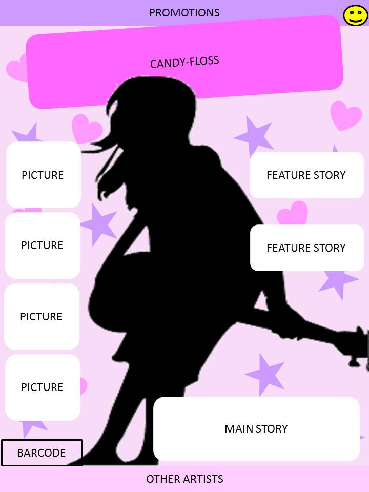
My Preliminary Task - Contents Page
+-.jpg)
All the pictures on the contents page are origional. To create this magazine for my target audience of students, teacher and parents, I found it hard to code it becuase the demographic was a wide range of different people. What students like might not be exactly what teachers or parents like (visa-versa).
My Preliminary Task - Front cover
.jpg)
I created my preliminary task using Microsoft Publisher. All the images were origional and the magazine was based on my schools newsletter.
Friday, 20 April 2012
Qualitative Data - Focus Group
I gave questions to a group of teenage students aged between 11 and 16. I asked them questions about their favourite colours and favourite bands to see what type of things they would like to see in a magazine. I then showed them the templates (front page, contents page and double page spread) for my magazine and asked for their opinion.
Template 1
I colleceted information from a focus group about the template I have done for my music magazine. They liked the bright, watered down colours becuase most of the focus groups favourite colour is pink. They also liked the structure and how it is not too clustered with other stories which might over cloud the main story. However, they would have prefered it if the main story heading went over the picture so they look inter-linked. Also, they would have prefered it if the stars and hearts in the background were smaller so it doesn't look too childish. Their favourite aspect of this was the pale colours and how all the colours blended in together. They also found that the smilie face in the corner looked out of place becuase of the colour.

Template 1
I then moved to the contents page and showed them both of the content page templates. They immediately prefered template 1 becuase of the stucture and colour theme. They called it 'cute' and 'fun'. They liked the way it was contructured with the different sections for different parts of the magazine and also the website link as it is noticeable by the way it goes across square of one of the parts.

Template 1
Finally, I gave them the templates for the double page spread. They prefered template 1 over template 2 however not by far. They liked how the image would go over both pages so it would show that the main focus is the artist. They also said the boxes on the side made it look more compete as there would be more content to look at as well as the aticle. However, they did suggest the the 'title of the magazine' was too bright and didn't go with the thme of the double page spread. They liked the heart becuase it was assosicating them with the heart.
Subscribe to:
Comments (Atom)